Una vez que su primera aplicación React Native ha sido creada y está en funcionamiento, es posible que desee reutilizar ciertos elementos como componentes funcionales. Estos componentes pueden configurarse para otras aplicaciones y compartirse como una biblioteca.
Descripción
En este tutorial, vamos a empezar con una aplicación sencilla que contiene cuatro botones. Vamos a crear un componente funcional configurable de React Native en un archivo fuente que reutilizaremos en el archivo principal de la aplicación.
Veremos cómo:
- pasar propiedades a un componente
- recuperar datos de componentes a partir de eventos
- utilizar un componente definido en un archivo fuente en el archivo principal
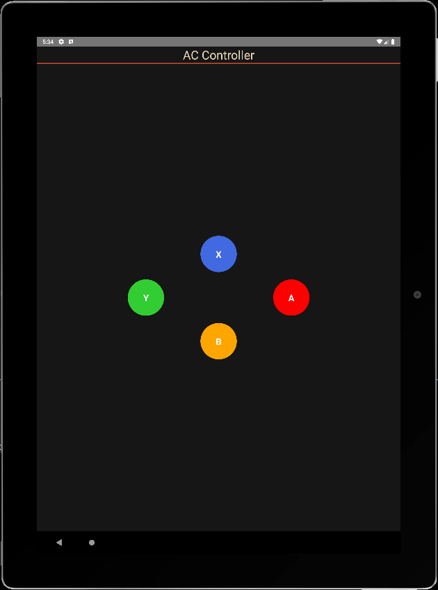
Aplicación básica: 4 botones
En este código, tenemos una vista principal (View) que cubre la pantalla, el título de la aplicación, y la vista que contiene los 4 botones. Las funciones que se realizan al pulsar los botones y los estilos definidos.
/**
 * https://github.com/jim-at-jibba/react-native-game-pad
 * https://github.com/ionkorol/react-native-joystick
 *
 */
import React from "react";
import { StyleSheet, Text, TouchableOpacity, View } from "react-native";


const GamePad = () =>  {

  let btnAColor = "red",
      btnBColor = "orange",
      btnXColor = "royalblue",
      btnYColor = "limegreen"

  const onButtonAPress = () => {
    console.log('You clicked button A');
  };
  const onButtonBPress = () => {
    console.log('You clicked button B');
  };

  const onButtonXPress = () => {
    console.log('You clicked button X');
  };
  const onButtonYPress = () => {
    console.log('You clicked button Y');
  };


    return (
      <View style={styles.mainBody}>
          <Text
            style={styles.mainTitle}>
            AC Controller
          </Text>
          <View style={{ flex: 1,justifyContent: "center", alignItems: "center",}}>
              <View
                style={{
                  //flex: 1,
                  justifyContent: "center",
                  alignItems: "center",
                  //backgroundColor:"green",
                  zIndex: 100,
                }}
              >
                <TouchableOpacity
                  style={[styles.button, {  top:"30%",backgroundColor: `${btnXColor}` }]} //top:"30%", right:"1%",
                  onPress={() => onButtonXPress()}
                >
                  <Text style={styles.buttonText}>X</Text>
                </TouchableOpacity>
              </View>

              <View
                style={{
                  //flex: 1,
                  justifyContent: "center",
                  alignItems: "center",
                  //backgroundColor:"gold",
                }}
              >
                <TouchableOpacity
                  style={[styles.button, { top: "50%", right:"20%", backgroundColor: `${btnYColor}` }]} //top:"2%", left:"10%",
                  onPress={() => onButtonYPress()}
                >
                  <Text style={styles.buttonText}>Y</Text>
                </TouchableOpacity>
              </View>

              <View
                style={{
                  //flex: 1,
                  justifyContent: "center",
                  alignItems: "center",
                  //backgroundColor:"blue",
                }}
              >
                <TouchableOpacity
                  style={[styles.button, { bottom:"50%", left:"20%", backgroundColor: `${btnAColor}` }]} //bottom:"2%",
                  onPress={() => onButtonAPress()}
                >
                  <Text style={styles.buttonText}>A</Text>
                </TouchableOpacity>
              </View>


            <View
                style={{
                  //flex: 1,
                  justifyContent: "center",
                  alignItems: "center",
                  //backgroundColor:"red",
                }}
              >
                <TouchableOpacity
                  style={[styles.button, { bottom:"30%", backgroundColor: `${btnBColor}` }]} //bottom:"30%", left:"1%",
                  onPress={() => onButtonBPress()}
                >
                  <Text style={styles.buttonText}>B</Text>
                </TouchableOpacity>
              </View>

          </View>
      </View>

    );
}
export default GamePad;

//parameters
let BACKGROUND_COLOR = "#161616"; //191A19
let BUTTON_COLOR = "#346751"; //1E5128
let ERROR_COLOR = "#C84B31"; //4E9F3D
let TEXT_COLOR = "#ECDBBA"; //D8E9A8

const styles = StyleSheet.create({

  mainBody: {
    flex:1,
    justifyContent: 'center',
    alignItems: "center",
    color:TEXT_COLOR,
    backgroundColor: BACKGROUND_COLOR,
  },

  mainTitle:{
    color: TEXT_COLOR,
    fontSize: 30,
    textAlign: 'center',
    borderBottomWidth: 2,
    borderBottomColor: ERROR_COLOR,
    width:"100%"
  },

  button: {
    height: 90,
    width: 90,
    borderRadius: 90 / 2,
    justifyContent: "center",
    alignItems: "center"
  },
  buttonText: {
    fontSize: 22,
    color: "white",
    fontWeight: "700"
  },


});
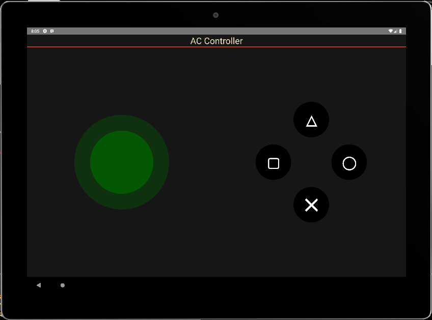
al pulsar los botones se ejecutan correctamente las funciones del evento
 BUNDLE  ./index.js

 LOG  Running "CustomApp" with {"rootTag":31}
 LOG  You clicked button Y
 LOG  You clicked button X
 LOG  You clicked button A
 LOG  You clicked button B
Llamar al componente desde un archivo fuente
Vamos a colocar este código en un archivo .
Para poder utilizarla, utilizamos la palabra clave export para definir la función
export const ButtonPad = ()  =>  {
...
}
A continuación, el componente puede utilizarse importándolo
import {ButtonPad} from "./src/ACJoysticks";
const GamePad = () =>  {
    return (
      <View style={styles.mainBody}>
          <Text
            style={styles.mainTitle}>
            AC Controller
          </Text>
          <ButtonPad/>
      </View>

    );
};
export default GamePad;
Pasar propiedades a un componente funcional
Para que el componente sea configurable, definimos parámetros en el fichero principal que se pasarán a las propiedades del componente. Las propiedades que queremos pasar al componente son:
- el texto que aparece en los botones
- el color de los botones
- el tamaño de los botones
- la función onClick, que gestiona todos los botones
Los parámetros del componente se colocan en un ButtonPadProps tipo
type ButtonPadProps = {
  radius?: number;
  names?: string[4];
  colors?: string[4];
  onClick?:(evt: ButtonPadEvent) => void;
};
A continuación, podemos definir estas propiedades como entrada del componente y llamarlas con valores por defecto.
export const ButtonPad = (props : ButtonPadProps)  =>  {
  const { onClick, radius = 45, names= ['X','Y','A','B'], colors = ["royalblue","limegreen","red","orange"] } = props;
Definimos una única función para llamar a los botones
  const onButtonPress = (index:number) => {
    console.log('You clicked button ' + names[index]);
  };
Por último, modificamos el código para tener en cuenta las distintas propiedades.
/**
 * ButtonPad
 */

type ButtonPadProps = {
  radius?: number;
  names?: Array<string>;
  colors?: Array<string>;
  onClick?:(evt: ButtonPadEvent) => void;
};

export const ButtonPad = (props : ButtonPadProps)  =>  {
  const { onClick, radius = 45, names= ['X','Y','A','B'], colors = ["royalblue","limegreen","red","orange"] } = props;
  let textSize = radius;

  const onButtonPress = (index:number) => {
    console.log('You clicked button ' + names[index]);
  };


    return (

          <View style={{ flex: 1,justifyContent: "center", alignItems: "center",}}>
              <View
                style={{
                  //flex: 1,
                  justifyContent: "center",
                  alignItems: "center",
                  //backgroundColor:"green",
                  zIndex: 100,
                }}
              >
                <TouchableOpacity
                  style={[{
                    height: 2*radius,
                    width: 2*radius,
                    borderRadius: radius,
                    justifyContent: "center",
                    alignItems: "center"
                  }, {  top:"30%",backgroundColor: `${colors[0]}` }]} //top:"30%", right:"1%",
                  onPress={() => onButtonPress(0)}
                >
                  <Text style={{
                            fontSize: textSize,
                            color: "white",
                            fontWeight: "700"
                          }}>{names[0]}</Text>
                </TouchableOpacity>
              </View>

              <View
                style={{
                  //flex: 1,
                  justifyContent: "center",
                  alignItems: "center",
                  //backgroundColor:"gold",
                }}
              >
                <TouchableOpacity
                  style={[{
                    height: 2*radius,
                    width: 2*radius,
                    borderRadius: radius,
                    justifyContent: "center",
                    alignItems: "center"
                  }, { top: "50%", right:"20%", backgroundColor: `${colors[1]}` }]} //top:"2%", left:"10%",
                  onPress={() => onButtonPress(1)}
                >
                  <Text style={{
                            fontSize: textSize,
                            color: "white",
                            fontWeight: "700"
                          }}>{names[1]}</Text>
                </TouchableOpacity>
              </View>

              <View
                style={{
                  //flex: 1,
                  justifyContent: "center",
                  alignItems: "center",
                  //backgroundColor:"blue",
                }}
              >
                <TouchableOpacity
                  style={[{
                    height: 2*radius,
                    width: 2*radius,
                    borderRadius: radius,
                    justifyContent: "center",
                    alignItems: "center"
                  }, { bottom:"50%", left:"20%", backgroundColor: `${colors[2]}` }]} //bottom:"2%",
                  onPress={() => onButtonPress(2)}
                >
                  <Text style={{
                            fontSize: textSize,
                            color: "white",
                            fontWeight: "700"
                          }}>{names[2]}</Text>
                </TouchableOpacity>
              </View>


            <View
                style={{
                  //flex: 1,
                  justifyContent: "center",
                  alignItems: "center",
                  //backgroundColor:"red",
                }}
              >
                <TouchableOpacity
                  style={[{
                    height: 2*radius,
                    width: 2*radius,
                    borderRadius: radius,
                    justifyContent: "center",
                    alignItems: "center"
                  }, { bottom:"30%", backgroundColor: `${colors[3]}` }]} //bottom:"30%", left:"1%",
                  onPress={() => onButtonPress(3)}
                >
                  <Text style={{
                            fontSize: textSize,
                            color: "white",
                            fontWeight: "700"
                          }}>{names[3]}</Text>
                </TouchableOpacity>
              </View>

          </View>
    );
}
Pasar datos del componente a la aplicación
Para devolver datos a la aplicación principal, utilizamos una interfaz que contiene los estados de los botones y el nombre del botón pulsado
interface ButtonPadEvent {
  states : Array<boolean>;
  pressed: string;
}
Modificamos la función onButtonPress para alimentar los estados y enviarlos a la función onClick.
  const onButtonPress = (index:number) => {

    let btnStates= [false,false,false,false];
    btnStates[index] = true;

    if(typeof(onClick)==="function"){
      onClick({
             states: btnStates,
             pressed: names[index]
         });
       }
  };
N.B.: La notación if(typeof(onClick)===»function»){ onClick() } es equivalente a onClick && onClick()
Ahora podemos llamar a nuestro componente en la aplicación principal, crear una función de escucha y modificar sus parámetros.
const GamePad = () => {
const onPadClick = (data: any) => {
console.log("form ButtonPad: ",data);
}
return (
<View style={styles.mainBody}>
<Text
style={styles.mainTitle}>
AC Controller
</Text>
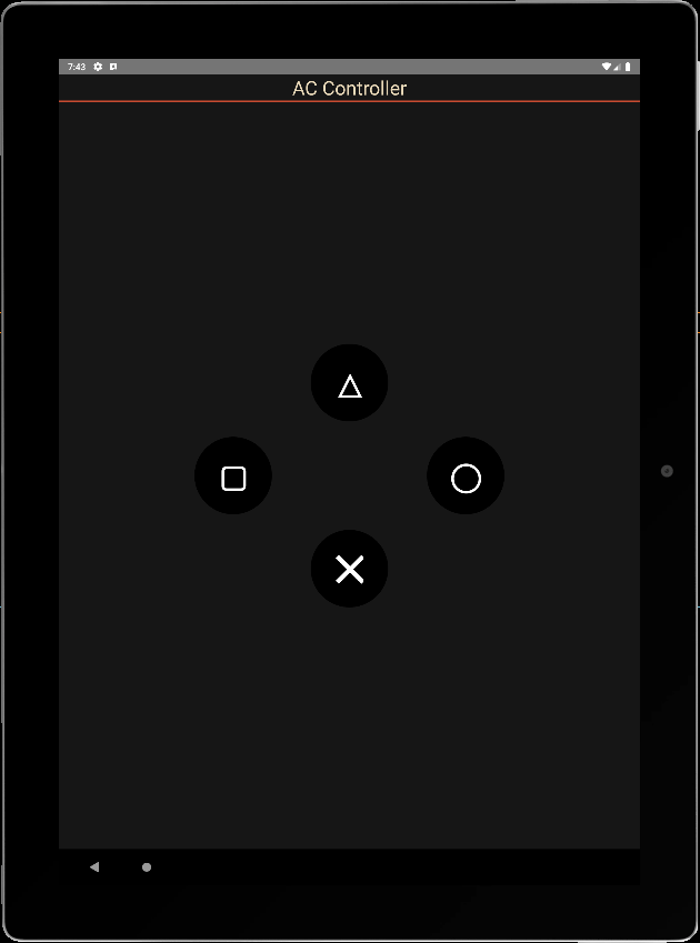
<ButtonPad radius={60} names={['\u2573', '\u25EF', '\u25B3', "\u25A2"]} colors={['black', 'black', 'black', 'black']} onClick={onPadClick} />
</View>
);
}
export default GamePad;
info Reloading app...
 BUNDLE  ./index.js

 LOG  Running "CustomApp" with {"rootTag":81}
 LOG  form ButtonPad:  {"pressed": "╳", "states": [true, false, false, false]}
 LOG  form ButtonPad:  {"pressed": "△", "states": [false, false, true, false]}
 LOG  form ButtonPad:  {"pressed": "▢", "states": [false, false, false, true]}
 LOG  form ButtonPad:  {"pressed": "◯", "states": [false, true, false, false]}
N.B.: para hacer las cosas correctamente, tendrías que crear los observadores onPressIn y onPressOut para poner los estados a cero y modificar la lógica para escuchar varios botones a la vez.
Código completo
./src/ACJoysticks.tsx
/**
 * ButtonPad
 */

interface ButtonPadEvent {
  states : Array<boolean>;
  pressed: string;
}

type ButtonPadProps = {
  radius?: number;
  names?: Array<string>;
  colors?: Array<string>;
  onClick?:(evt: ButtonPadEvent) => void;
};


export const ButtonPad = (props : ButtonPadProps)  =>  {
  const { onClick, radius = 45, names= ['X','Y','A','B'], colors = ["royalblue","limegreen","red","orange"] } = props;
  let textSize = radius;
  let btnStates= [false,false,false,false];

  const onButtonPress = (index:number) => {
    btnStates[index] = true;

    if(typeof(onClick)==="function"){
      onClick({
             states: btnStates,
             pressed: names[index]
         });
       }
  };

  const onButtonRel = (index:number) => {
    btnStates[index] = false;

    if(typeof(onClick)==="function"){
      onClick({
             states: btnStates,
             pressed: names[index]
         });
       }
  };

    return (

          <View style={{ flex: 1,justifyContent: "center", alignItems: "center",}}>
              <View
                style={{
                  //flex: 1,
                  justifyContent: "center",
                  alignItems: "center",
                  //backgroundColor:"green",
                  zIndex: 100,
                }}
              >
                <TouchableOpacity
                  style={[{
                    height: 2*radius,
                    width: 2*radius,
                    borderRadius: radius,
                    justifyContent: "center",
                    alignItems: "center"
                  }, {  top:"30%",backgroundColor: `${colors[0]}` }]} //top:"30%", right:"1%",
                  //onPress={() => onButtonPress(0)}
                  onPressIn={() => onButtonPress(0)}
                  onPressOut={() => onButtonRel(0)}
                >
                  <Text style={{
                            fontSize: textSize,
                            color: "white",
                            fontWeight: "700"
                          }}>{names[0]}</Text>
                </TouchableOpacity>
              </View>

              <View
                style={{
                  //flex: 1,
                  justifyContent: "center",
                  alignItems: "center",
                  //backgroundColor:"gold",
                }}
              >
                <TouchableOpacity
                  style={[{
                    height: 2*radius,
                    width: 2*radius,
                    borderRadius: radius,
                    justifyContent: "center",
                    alignItems: "center"
                  }, { top: "50%", right:"20%", backgroundColor: `${colors[1]}` }]} //top:"2%", left:"10%",
                  //onPress={() => onButtonPress(1)}
                  onPressIn={() => onButtonPress(1)}
                  onPressOut={() => onButtonRel(1)}
                >
                  <Text style={{
                            fontSize: textSize,
                            color: "white",
                            fontWeight: "700"
                          }}>{names[1]}</Text>
                </TouchableOpacity>
              </View>

              <View
                style={{
                  //flex: 1,
                  justifyContent: "center",
                  alignItems: "center",
                  //backgroundColor:"blue",
                }}
              >
                <TouchableOpacity
                  style={[{
                    height: 2*radius,
                    width: 2*radius,
                    borderRadius: radius,
                    justifyContent: "center",
                    alignItems: "center"
                  }, { bottom:"50%", left:"20%", backgroundColor: `${colors[2]}` }]} //bottom:"2%",
                  //onPress={() => onButtonPress(2)}
                  onPressIn={() => onButtonPress(2)}
                  onPressOut={() => onButtonRel(2)}
                >
                  <Text style={{
                            fontSize: textSize,
                            color: "white",
                            fontWeight: "700"
                          }}>{names[2]}</Text>
                </TouchableOpacity>
              </View>


            <View
                style={{
                  //flex: 1,
                  justifyContent: "center",
                  alignItems: "center",
                  //backgroundColor:"red",
                }}
              >
                <TouchableOpacity
                  style={[{
                    height: 2*radius,
                    width: 2*radius,
                    borderRadius: radius,
                    justifyContent: "center",
                    alignItems: "center"
                  }, { bottom:"30%", backgroundColor: `${colors[3]}` }]} //bottom:"30%", left:"1%",
                  //onPress={() => onButtonPress(3)}
                  onPressIn={() => onButtonPress(3)}
                  onPressOut={() => onButtonRel(3)}
                >
                  <Text style={{
                            fontSize: textSize,
                            color: "white",
                            fontWeight: "700"
                          }}>{names[3]}</Text>
                </TouchableOpacity>
              </View>

          </View>
    );
}
./App.tsx
import React from "react";
import { StyleSheet, Text, TouchableOpacity, View } from "react-native";
import {ButtonPad} from "./src/ACJoysticks";

const GamePad = () =>  {
  const onPadClick = (data: any) => {
    console.log("from ButtonPad: ",data);
    //data.states[0], data.pressed
  }

    return (
      <View style={styles.mainBody}>
          <Text
            style={styles.mainTitle}>
            AC Controller
          </Text>
          <ButtonPad radius={60} names={[ '\u25B3', '\u25A2', '\u25EF',  '\u2573',]} colors={['black', 'black', 'black', 'black']} onClick={onPadClick} />
      </View>

    );
}
export default GamePad;

//parameters
let BACKGROUND_COLOR = "#161616"; //191A19
let BUTTON_COLOR = "#346751"; //1E5128
let ERROR_COLOR = "#C84B31"; //4E9F3D
let TEXT_COLOR = "#ECDBBA"; //D8E9A8

const styles = StyleSheet.create({

  mainBody: {
    flex:1,
    justifyContent: 'center',
    alignItems: "center",
    color:TEXT_COLOR,
    backgroundColor: BACKGROUND_COLOR,
  },

  mainTitle:{
    color: TEXT_COLOR,
    fontSize: 30,
    textAlign: 'center',
    borderBottomWidth: 2,
    borderBottomColor: ERROR_COLOR,
    width:"100%"
  },
});
Aplicaciones
- Cree componentes reutilizables y configurables para sus aplicaciones
- Cree aplicaciones para controlar sus proyectos mediante Bluetooth, BLE o Wifi